Sunday, 28 February 2010

Digipak Research:

Here is an example of a 4 sided digipak:

Below are the two inside panels of the digipak, these act as sleeves for the CD and a booklet for the album. Both feature a landscape photo of the band, with the left side including credits.


Here is the reverse of the digipak, featuring the track listing.


This is an example of an eight sided digipak:


The track listing.

Two of the four inside panels featuring two iconic images of The Smiths.


The four inside panels, the two middle panels featuring CD trays for the double disc album. behind the Cd features various album artwork by The Smiths.

We have decided to produce a four panel digipak. One front cover for the album artwork, one reverse side for album track listing, an inside panel featuring a photo of the band and another featuring a tray for a disc.

Saturday, 27 February 2010

Prodigy - Smack My Bitch Up:

Warning- The video contains nudity, sex and violence.

This is the controversial video to The Prodigy's Smack My Bitch Up, getting banned from various television stations including MTV the unedited version features drug abuse, hit and run incident, violence, nudity and sex. Despite the controversy it is considered by some to be one of the best music videos of all time, and I certainly agree. With a twist that will continue shock viewers forever. But ultimately it is the brilliant first person point of view camera work that makes it so brilliant.

This style of camera work which is maintain throughout the whole video, keeps the identity of the protagonist hidden, and it is only until the end when a woman is revealed in a mirror that the viewers finally realise the shocking truth. It is assumed up until that point that the protagonist is a male, with the laddish behaviour; drinking, taking drugs, being reckless and violent. The ending breaks stereotypes.

The problem with our video at the moment is that we haven't kept the identity of the person our protagonist secret, therefore we have lost the shocking homosexual ending that first attracted us all to the idea. When we re-shoot our video, it will be our aim to keep the identity of the secret partner (ie. Me) hidden at all costs. Whether this be via a series of point of view shots or other clever camera work. In addition it is the behaviour of the lead in Smack My Bitch Up that makes the ending all the more shocking, in our case I would have to act like a female to mirror the same sort of idea, and leave the audience thinking this is just an ordinary one night stand.

Thursday, 25 February 2010

Shooting Schedule 3:

Monday 1st March
On this day we plan to film everything we possible explained in the 'teacher feedback 3' post that includes just the protagonist (Jack Clegg) and his mysterious lover (Me). This will be the bulk of verse one and part of verse 2, as well as almost all of the flashback scenes.

Shots we need include:
For the verses:
  • Jack waking up to discover what he has just done. ie. Look down at a pile of clothes and a condom.
  • Leaving the bedroom to go to the bathroom
  • Looking at himself in the bathroom mirror to see a bear mask stare back at him.
  • Shower scene, Jack 'washing away the guilt'.
  • Coming back to his bedroom to get dressed.
Flashbacks (all from my point of view):
  • Jack being pushed onto his bed by me.
  • Undressing each other.
  • Various different sexually suggestive positions, without revealing my identity.

Teacher Feedback (Rough Cut):

The footage we got from the 10/02/10 helped us make a short rough cut. We made the verses more interesting by adding in various small montages, relating to the sexual act that took place. In addition Jordan edited together a chorus which featured Todd Cook and Jack Clegg miming the chorus. Here he used various different editing techniques to make it less monotonous, which was one of Mrs. McLuckie's main criticisms of our previous footage. He did this via a variety of split screen shots and by quickly swapping the camera angles, to give it a distorted effect.

We then showed Mrs. McLuckie, and let's just say she was less than pleased with our efforts. Reviewing the whole video again she basically scrapped all our footage. Criticisms included; Jack's performance was not good enough, the lighting was bad, the shots were too static, in some cases there was too much going on and the party scenes were not executed well by various party goers ruining the shot by jumping up and down behind the protagonist. However she did like the juxtaposition of the young boy and Jack, and the use of split screen editing.

It was a shock to all of us we thought that we were on the right lines, and with the deadline in four weeks it was a massive push back. But of course Mrs. McLuckie knows what she is talking about, and it is her opinions that will help us achieve the A grade us all so desperately want. The consensus was that we had a great idea, but have not really executed it well. So it was back to square one, we had to rethink the whole video.

The first thing we unanimously decided was to scrap Jack miming the verses completely and fill them with narrative based shots. But keep him miming on the chorus, which will focus more on the young boy segments. Now the story will focus more on the morning after, or just hours after the protagonist has had sex. Therefore it will be him waking up, slowly realising what he has done, and soon regretting his actions.

He will wake up to be greeted with the sight of clothes on the floor and a condom wrapper, clearly illustrating what has just happened. Consequently he tries to relax himself with a cigarette, and then goes into the bathroom to cleanse himself thoroughly. Before getting dressed and making his way downstairs to the after effects of a party, so people clambered over the floor, mess and drink everywhere. Upon seeing who he has just slept with he goes crazy breaks out the house, collapses outside the front door in a crying state, consequently leading to the last scene which will see him reunited with his one night stand, and conclude on an image of the two kissing. All this will be in twined with short flashback shots of the night before, as well as random images, which we have used previously.

Initially the idea was that the protagonist was going to storm out of the house running down the street before collapsing, and then being faced with his one night stand. However Mrs. McLuckie ruled this out, because rarely does a scene featuring running work out well, and it would be extremely hard to film. Therefore we tweaked the ending slightly. Furthermore Miss picked up on several shots which featured animal masks, and it was suggested that this should be presented as one of the main themes of the video. Initially the masks were meant to represent the fact that the person the lead sleeps with is unknown, as well as the protagonists hidden identity as a homosexual. It still will, and we will try and nod at the masks in each scene, whether it is subtle with the mask just resting on the bed, or Jack looking in the mirror to see himself with a mask on.


Another criticism of our video was that there wasn't a given style; the lighting constantly seemed to fluctuate, so on the next shoot we will try to maintain a continuous lighting pattern that will reflect the mood of the story. Also we need to film more of the young boy scenes, so it makes more sense to the viewer as to what is going on, as well as maintaining the juxtaposition with the protagonist.

Wednesday, 24 February 2010

Rough Cut:

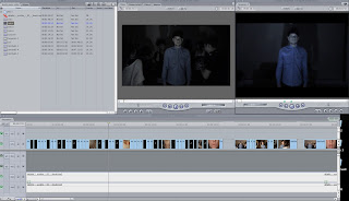
This is a basic rough cut of the first verse and chorus.

Friday, 12 February 2010

Us at Work:

Here are photos of us working away at the video, and teh respective ancillery tasks.


Album Artwork First Draft:

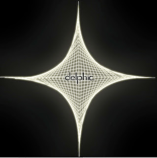
This is the first draft of our album artwork. We placed an outer glow around the Spiro graph. It is very simple, just white on black; however the complexity of the actual Spiro graph gives it a 3D feel. Furthermore the logo I designed is illuminated in the middle of the Spiro graph. I have kept the logo small, so it is subtle yet still eye catching. At the moment the album name 'Acolyte' is not present, this may remain to be the case, and just include it on the side of the digipak.
Thursday, 11 February 2010

Logo:

This is a logo I designed for both the website and digipak. I have taken a simplistic approach, choosing lower case, thin black lettering. The gap in between some of the consonants gives it that extra edge that adds to the 'indie/electronica' genre.

Filming - 10/02/10:

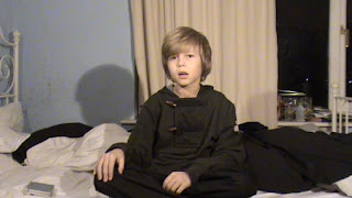
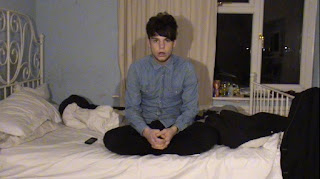
We went round to Jack Clegg's to film the small clip scenes for the various montages as well as the young boy segments. However we decided to get the young boy (ie Todd Cook)to mime the chorus. We set him up on Jack's bed and he sat there with a vulnerable look on his face. This is meant to be the result of what he had just scene. Which is of course a sexual act. Consequently he is shell shocked and confused. The character of the young boy is supposed to be the protagonist's younger self. Therefore we filmed Jack sitting in the exact same position, so we can flip between them during the chorus to show the progression, and how seeing the sexual act has affected him as both a youngster and his present self.


Todd and Jack don't look like each other as much as we hoped, but I think it is suggested through the positions that they are the same person. Additionally we did film scenes of Todd in the closet (implications to the plot's narrative) watching the sexual act. However it is unlikely that we stick with the original idea of this being projected on either a wall or television screen. We will include most probably include these scenes during the chorus itself, so it isn't just a boring miming section.


Wednesday, 10 February 2010

Possible Logos:

Website Mock-Up

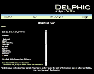
This is a basic website we have mocked up after looking at existing websites and following the conventions. We have kept it to an absolute minimum. In the big black space we will post a video of our new single as well as an album advert. Furthermore there will be more links in the top bar. But we don't want to overload it with pictures, and unnecessary links.
Tuesday, 9 February 2010

Shooting Schedule 2

Wednesday 10th February
After reviewing our footage from 01/02/10 there were some scenes that were more acceptable than others, and we found ourselves with a lot of small gaps where we would fit in small random clips. Although we need to film some of the party scenes again, most people couldn't make it, so we compiled a list of short random things that will fill the gaps.
Including:
  • A homosexual kiss
  • Lights being switched on.
  • A spinning coin.
  • Rolling of dice.
  • Jack Clegg looking into a mirror.
  • Washing hands.
  • Shower scene.
  • Crying.
  • Biting of lip.
  • Rolling/ Smoking a cigarette.
  • Drinking Milk.
  • Scrunching hair.
  • Key in a door.
  • Biting an apple.
  • Close up of eye opening.
All these may seem random, but in context they have hidden meanings and relevance to the narrative of our video. Furthermore we will be filming the scenes of the young boy (Todd Cook), which will be used for the choruses. We will have to plan a date in the half term or soon after for the remainder of the party scenes, as well as the stuff we have to re-shoot.

Empty Vessels:

It was suggested that we should watch this video for inspiration by our friend and music video star Jack Clegg. It is a recent collaboration between The Maccabees and Roots Manuva called 'Empty Vessels'. We watched the video, and it was awe inspiring. The editing and camera work is outstanding. Shots i am particularly fond of include the focus pull to show the young boy's sweating chest ( 02.00) and the point at which the young boy's nose starts to bleed(02.37). The camera movements and editing reflect the pace of the music perfectly.
The video itself seems to follow several narratives. Exploring each one in little detail via beautifully explicit shots. The camera is rarely static and the cuts are rapid constantly focusing on the array of narratives to grab and maintain the viewer's attention. Furthermore there are a lot of close ups of the actors, as well as close ups of recurring images, such as the spinning coin, the blank television set and the doll's house. Which all help explore the narratives further.
Although our video has one underlying narrative, seeing this video has helped develop our ideas for when we film again on Wednesday 10th February. We will try and avoid monotonous static shots, and include more close ups of our protagonist, as well small clips which represent the narrative of a closet homosexual. We already have a 'sex scene', so more subtle shots are required. Ideas include a frustrated biting of the lips, biting a red apple (forbidden fruit) and many more.

Teacher Feedback 2:

Editing together our footage from 1st February proved reasonably successful; we had enough shots to make a satisfactory introduction. The introduction has come out exactly the way we intended. It features the strobe lighting, the quick editing, the sexually suggestive cuts, and it all flowed perfectly to the music.


Satisfied with the introduction we then edited a rough first verse together. On completion we decided to show Mrs McLuckie what we had done so far, to see if we were going in the right direction or if we will need to scrap it all completely and film everything again.

Evidently the introduction seemed to receive praise. However the same can't be said for the first verse. Criticism was that the shots were too static and monotonous. The consensus was that the introduction would catch the viewer's attention, but they would drift away before the end of the first verse. Additionally we decided to get a second opinion and show several of our peers, and it was unanimous that the introduction was fine, but the first verse needed a little tweaking.

It wasn't the end of the world we were on the right track, so we went back to final cut and made the first verse more interesting by adding in small montages in between various cuts to keep audiences hooked.

After we completed the first verse we looked at our footage for the chorus, and felt it wasn't good enough, it faced the same problem it was too static and boring. Furthermore we kept recycling the same montage clips. So it was obvious we had a lot more to film.

On the next filming trip we will need to film the verses again, the choruses, plenty of short random clips as well as sections of the storyboard we haven't even started to film. It sounds taxing yet possible.

Website Conventions:

In the post 'Website inspiration' I looked at several sites that i felt had the same look we want to achieve with are website. Although each site differed in some aspects. They all followed some codes and convention which we will try to maintain in the production of our website.
Take Delphic's own website as an example:


Firstly they feature the bands logo in some form. This helps fans recognise that they are on the correct site. This is usually a large size and featured somewhere near the top of the page. In this case it is in the top left.


A homepage would feature links to other pages on the website, again these are likely to be located at the top of the page (In Delphic's case just below the logo). These usually are kept to a minimum (usually 4 or 5). Key links would include:
  • Home - Just a link back to the home page if you leave it.
  • About/ Bio - biography of the band.
  • Gigs - Gives information about upcoming gigs and festival appearances. This would include links to ticket websites.
  • Videos - will give access to music videos from the band as well as live clips.
  • Photos/Gallery - Images of the band. Can include photos from the studio, as well as live appearances.
  • Store - Gives fans the opportunity to perhaps purchase some of the band's music of even merchandise, such as; t shirts and posters.
  • Sign Up/Login - This is where fans can join mailing list or login as a member of the fan club.
  • Forum - Members can post comments and create subjects about the band in question and interact with other fans. This is becoming increasingly popular with the increase in pull media. Most notably social networking sites.


Furthermore the home page would have a main feature. This could either be a video, an image, a blog and in Delphic's case a newsfeed.


It seems as though most bands websites are minimalistic, and are not crammed with information, pictures or videos. They normally act as a promotional tool, and often the content changes, alongside a new single/album releases. The home page would be predominantly catered around that new single/album. This would be through the use of still advertisements, videos and links. The key is home page need to be simple, and eye catching, so fans are not swamped with information they don't want and can easily navigate their way around the website. These are all conventions which we hope will be included in the production of our own website.

Website Inspiration:


This homepage is very plain and simplistic, with little images or videos, if any. However there is a lot of information which is constantly updated. It resembles a blog more than a website. To the right there is the bands logo, which has a nice interactive feature that transforms the characters if you however over them. Furthermore beneath this there are essential links to the rest of the website. Including; Gigs, Releases, Photos, Videos, etc. Additionally the website offers fans the chance to join their mailing list if they wish to receive email updates about the band, and it tells you where their album is available from. Websites act as a promotional tool.
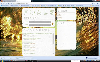
Foal's are very similar in the sense that they are both of the indie/ electronic' genre and are both relatively new bands. Again it is very basic. Featuring one image of a wage, and then four interactive boxes, each offering the audience a different piece of information. The top left box features the bands logo and the opportunity to sign up to their mailing list, beneath this there is a blog from the band. Which is interesting for the fans, who like to know a bit more about who they are listening to, they like to gain a connection with the band. In this day and age with the phenomenon twitter it is certainly becoming the norm. Therefore I feel this is a good feature. Furthermore one box features the essential links and another show where fans can see the band in their upcoming gigs.


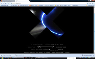
The xx logo of just the x is predominantly used throughout their methods of promotion. Their album artwork is a white x on a black background, and their television ad just features the same thing for about ten seconds. Here the website gives more away but is just as intriguing, with the unusual video clips that get played in the x. it features a mix of captivating clips, as well as clips of the band. It captures the audience's attention, before they later realise that the website offers the same features as most with the essential links at the bottom.


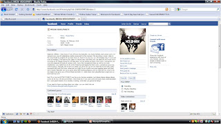
This website features the conventional links and promotional images. However it is predominantly a video player and the video playing is their new single. This acts as a good promotional tool, as it is impossible for the viewer to miss.

Organising the Shoot:


Seeing as though our music video is set at a party we needed to invite people around Jack Clegg's house to make it more authentic. When a real party is being organised the standard procedure is to send a facebook invite, consequently we did the same thing. We invited 20 or so of our closest friends to come round on Monday 1st February. In this day and age most people have facebook page therefore it was the easiest most efficient way of inviting people and finding out if they can and cannot come.


We offered food and refreshments to entice people around and It proved relatively successful and we had about 15 people turn up which was sufficient for the majority of our party scenes. We needed to fill up Jack Clegg's living room with people. This was easily achieved, with more than necessary. However it means we created a believable party atmosphere.

Monday, 8 February 2010