 This homepage is very plain and simplistic, with little images or videos, if any. However there is a lot of information which is constantly updated. It resembles a blog more than a website. To the right there is the bands logo, which has a nice interactive feature that transforms the characters if you however over them. Furthermore beneath this there are essential links to the rest of the website. Including; Gigs, Releases, Photos, Videos, etc. Additionally the website offers fans the chance to join their mailing list if they wish to receive email updates about the band, and it tells you where their album is available from. Websites act as a promotional tool.
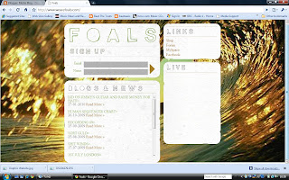
Foal's are very similar in the sense that they are both of the indie/ electronic' genre and are both relatively new bands. Again it is very basic. Featuring one image of a wage, and then four interactive boxes, each offering the audience a different piece of information. The top left box features the bands logo and the opportunity to sign up to their mailing list, beneath this there is a blog from the band. Which is interesting for the fans, who like to know a bit more about who they are listening to, they like to gain a connection with the band. In this day and age with the phenomenon twitter it is certainly becoming the norm. Therefore I feel this is a good feature. Furthermore one box features the essential links and another show where fans can see the band in their upcoming gigs.

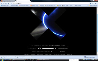
The xx logo of just the x is predominantly used throughout their methods of promotion. Their album artwork is a white x on a black background, and their television ad just features the same thing for about ten seconds. Here the website gives more away but is just as intriguing, with the unusual video clips that get played in the x. it features a mix of captivating clips, as well as clips of the band. It captures the audience's attention, before they later realise that the website offers the same features as most with the essential links at the bottom.
This website features the conventional links and promotional images. However it is predominantly a video player and the video playing is their new single. This acts as a good promotional tool, as it is impossible for the viewer to miss.


No comments:
Post a Comment