Showing posts with label Existing Products. Show all posts

Sunday, 28 February 2010

Digipak Research:

Here is an example of a 4 sided digipak:

Below are the two inside panels of the digipak, these act as sleeves for the CD and a booklet for the album. Both feature a landscape photo of the band, with the left side including credits.


Here is the reverse of the digipak, featuring the track listing.


This is an example of an eight sided digipak:


The track listing.

Two of the four inside panels featuring two iconic images of The Smiths.


The four inside panels, the two middle panels featuring CD trays for the double disc album. behind the Cd features various album artwork by The Smiths.

We have decided to produce a four panel digipak. One front cover for the album artwork, one reverse side for album track listing, an inside panel featuring a photo of the band and another featuring a tray for a disc.

Saturday, 27 February 2010

Prodigy - Smack My Bitch Up:

Warning- The video contains nudity, sex and violence.

This is the controversial video to The Prodigy's Smack My Bitch Up, getting banned from various television stations including MTV the unedited version features drug abuse, hit and run incident, violence, nudity and sex. Despite the controversy it is considered by some to be one of the best music videos of all time, and I certainly agree. With a twist that will continue shock viewers forever. But ultimately it is the brilliant first person point of view camera work that makes it so brilliant.

This style of camera work which is maintain throughout the whole video, keeps the identity of the protagonist hidden, and it is only until the end when a woman is revealed in a mirror that the viewers finally realise the shocking truth. It is assumed up until that point that the protagonist is a male, with the laddish behaviour; drinking, taking drugs, being reckless and violent. The ending breaks stereotypes.

The problem with our video at the moment is that we haven't kept the identity of the person our protagonist secret, therefore we have lost the shocking homosexual ending that first attracted us all to the idea. When we re-shoot our video, it will be our aim to keep the identity of the secret partner (ie. Me) hidden at all costs. Whether this be via a series of point of view shots or other clever camera work. In addition it is the behaviour of the lead in Smack My Bitch Up that makes the ending all the more shocking, in our case I would have to act like a female to mirror the same sort of idea, and leave the audience thinking this is just an ordinary one night stand.

Tuesday, 9 February 2010

Empty Vessels:

It was suggested that we should watch this video for inspiration by our friend and music video star Jack Clegg. It is a recent collaboration between The Maccabees and Roots Manuva called 'Empty Vessels'. We watched the video, and it was awe inspiring. The editing and camera work is outstanding. Shots i am particularly fond of include the focus pull to show the young boy's sweating chest ( 02.00) and the point at which the young boy's nose starts to bleed(02.37). The camera movements and editing reflect the pace of the music perfectly.
The video itself seems to follow several narratives. Exploring each one in little detail via beautifully explicit shots. The camera is rarely static and the cuts are rapid constantly focusing on the array of narratives to grab and maintain the viewer's attention. Furthermore there are a lot of close ups of the actors, as well as close ups of recurring images, such as the spinning coin, the blank television set and the doll's house. Which all help explore the narratives further.
Although our video has one underlying narrative, seeing this video has helped develop our ideas for when we film again on Wednesday 10th February. We will try and avoid monotonous static shots, and include more close ups of our protagonist, as well small clips which represent the narrative of a closet homosexual. We already have a 'sex scene', so more subtle shots are required. Ideas include a frustrated biting of the lips, biting a red apple (forbidden fruit) and many more.

Website Conventions:

In the post 'Website inspiration' I looked at several sites that i felt had the same look we want to achieve with are website. Although each site differed in some aspects. They all followed some codes and convention which we will try to maintain in the production of our website.
Take Delphic's own website as an example:


Firstly they feature the bands logo in some form. This helps fans recognise that they are on the correct site. This is usually a large size and featured somewhere near the top of the page. In this case it is in the top left.


A homepage would feature links to other pages on the website, again these are likely to be located at the top of the page (In Delphic's case just below the logo). These usually are kept to a minimum (usually 4 or 5). Key links would include:
  • Home - Just a link back to the home page if you leave it.
  • About/ Bio - biography of the band.
  • Gigs - Gives information about upcoming gigs and festival appearances. This would include links to ticket websites.
  • Videos - will give access to music videos from the band as well as live clips.
  • Photos/Gallery - Images of the band. Can include photos from the studio, as well as live appearances.
  • Store - Gives fans the opportunity to perhaps purchase some of the band's music of even merchandise, such as; t shirts and posters.
  • Sign Up/Login - This is where fans can join mailing list or login as a member of the fan club.
  • Forum - Members can post comments and create subjects about the band in question and interact with other fans. This is becoming increasingly popular with the increase in pull media. Most notably social networking sites.


Furthermore the home page would have a main feature. This could either be a video, an image, a blog and in Delphic's case a newsfeed.


It seems as though most bands websites are minimalistic, and are not crammed with information, pictures or videos. They normally act as a promotional tool, and often the content changes, alongside a new single/album releases. The home page would be predominantly catered around that new single/album. This would be through the use of still advertisements, videos and links. The key is home page need to be simple, and eye catching, so fans are not swamped with information they don't want and can easily navigate their way around the website. These are all conventions which we hope will be included in the production of our own website.

Website Inspiration:


This homepage is very plain and simplistic, with little images or videos, if any. However there is a lot of information which is constantly updated. It resembles a blog more than a website. To the right there is the bands logo, which has a nice interactive feature that transforms the characters if you however over them. Furthermore beneath this there are essential links to the rest of the website. Including; Gigs, Releases, Photos, Videos, etc. Additionally the website offers fans the chance to join their mailing list if they wish to receive email updates about the band, and it tells you where their album is available from. Websites act as a promotional tool.


Foal's are very similar in the sense that they are both of the indie/ electronic' genre and are both relatively new bands. Again it is very basic. Featuring one image of a wage, and then four interactive boxes, each offering the audience a different piece of information. The top left box features the bands logo and the opportunity to sign up to their mailing list, beneath this there is a blog from the band. Which is interesting for the fans, who like to know a bit more about who they are listening to, they like to gain a connection with the band. In this day and age with the phenomenon twitter it is certainly becoming the norm. Therefore I feel this is a good feature. Furthermore one box features the essential links and another show where fans can see the band in their upcoming gigs.


The xx logo of just the x is predominantly used throughout their methods of promotion. Their album artwork is a white x on a black background, and their television ad just features the same thing for about ten seconds. Here the website gives more away but is just as intriguing, with the unusual video clips that get played in the x. it features a mix of captivating clips, as well as clips of the band. It captures the audience's attention, before they later realise that the website offers the same features as most with the essential links at the bottom.


This website features the conventional links and promotional images. However it is predominantly a video player and the video playing is their new single. This acts as a good promotional tool, as it is impossible for the viewer to miss.

Saturday, 30 January 2010

Album Artwork Influences:

Acolyte - Delphic

This is Delphic's existing album cover for 'Acolyte'. We will be using the same name and track listing, but will change the logo, as well as the photo. Delphic have opted for a surreal photo of the band falling or floating it is not entirely clear. In addition there is a good water mark effect which spirals off each member. The logo is placed directly in the centre, and is very simplistic, whilst still managing to bounce off the cover, as the bright white is clearly defined over the dark figures. Furthermore i like the use of lighting, and the way it is really bright in the centre where the figures and logo are illuminated but the edges get darker and darker.

xx - The xx
This is a very simplistic album cover; however I feel it is very effective and certainly intriguing. The fact that it is simply just a white x on a black background makes me want to listen to it because the cover does not reveal a thing; it will all be saved for the music. Furthermore the simplicity reflects the beautiful basic beats within their music.

Primary Colours -The Horrors

Primary Colours is the second LP from The Horrors, this show cased a change in direction from the cartoon Goth rock band to psychedelic alternative rock pioneers. With many critics praising their new direction. Notably receiving a Mercury Music Prize nomination and topping NME's albums of 2009 list. In comparison to their first album cover (see below) the cover of this album seems to reflect their change. They both follow the same concept; the band sitting down staring directly at the camera. However Primary Colours is lighter which could tie in with them moving away from their previous 'darker' music. Also the fact that the image is distorted shows that this time round they are focusing less on their image. Their image was a large part to the success of the first album, and helped to establish them in the music industry. With Primary Colours they have toned it down completely, presumably to make a mark that the music is more important than the image.

It's Blitz - Yeah Yeah Yeah's

This is the third LP from New Yorker's Yeah Yeah Yeah's. What i particularly like about this photo is that it doesn't seem to have been manipulated at all. It is a natural photo of a female arm cracking an egg in her palm. I like the way it looks almost dynamic, and the stage of egg cracking makes it almost difficult to realise exactly what it is. In addition it symbolises the album title perfectly. The title 'It's Blitz' refers to mayhem and destruction. This is reflected in the not so threatening breaking of an egg.

Merriweather Post Pavilion - Animal Collective

This is a particular favourite of mine. Upon first glance it seems like an ordinary pattern just placed on an album cover. If you look closely the greenery moves. It is an optical illusion based on the works of Japanese psychologist Akiyoshi Kitaoka. It is visually compelling, it is more than just an album cover it is an optical illusion.

Bloc Party
Silent Alarm

A Weekend In The City
Intimacy

Bloc Party are similar to Delphic in the sense that they make indie/ electronic enthused music. They are a band who consistently delivers outstanding album artwork. The images above are their three albums, each one telling a different narrative with the title and image. The first one 'Silent Alarm' is my favourite; it is almost completely white apart from the desolate woodland landscape. The title corresponds with the artwork in the sense that if there was an alarm in that setting no one would hear it therefore it would be 'silent'. I feel it is an intelligent, yet captivating concept.
The second album ' A Weekend In The City' is very similar to the first in the sense they are both simplistic desolate images. Here it creates juxtaposition with the title because a city would be typically busy at the weekend, whereas the image shows an empty road. This could potentially represent Bloc Party breaking conventions visually as well as musically.
The third album does what it says on the tin. It is aptly titled intimacy, showing a couple being intimate. The intriguing thing behind this however is that it is basically just the lips. Consequently the identity of the two is unknown, suggesting that they could even be of the same gender. Again breaking conventions.

Other album covers I find inspirational:

Is This It? - The Strokes

Friendly Fires - Friendly Fires

Antidotes - Foals

Exile on Main ST. - Rolling Stones

After studying the artwork above. We have decided that a simple, yet awe inspiring image is what we want to put on our album. Our aim is to leave the audience staring in confusion. It doesn't necessarily have to reflect the music that would be on the CD, it would just have to be as captivating as the music itself.

Thursday, 7 January 2010

Lighting influences:

For the party scenes in our video, especially the intro, where the room fills with people on each beat. We plan to have strobe lighting. The effect we want to achieve has been inspired and is similar to these two videos.

Above is a Bloc Party video for their song 'Talons' which features the lead singer running through an abandoned car park, where the lights are constantly flashing, this creates an eerie blue strobe effect, which we want to try and achieve.

Additionally below is a short video posted by Delphic on their YouTube account, it features a sample of their song 'Counterpoint', and simply features a stop motion video of a neon light moving through an empty hallway, flashing and moving in time with the music. This is something we will have to consider in the editing process, the pace of the strobe will have to correspond to the pace of the music.

Wednesday, 16 December 2009

Music Video Analysis - Kiss and Tell:

You Me At Six - Kiss And Tell (HD) from theplaceofthelion on Vimeo.

Aside from Lady GaGa's 'Just Dance' another video that deals with the house party setting and narrative is 'Kiss and Tell' by You Me At Six. This is essentially a performance based video, with the previously mentioned British rock band, being the entertainment at a 'wild' house party.

This follows the codes and conventions of the rock genre in terms of establishing an act. There are regularly close ups of the band, and their respective instruments, reflected in what the audience hear in the music. Additionally there are close ups of the lead singer to accentuate his vocals.

The editing is relatively fast paced to reflect the nature of the bouncy soft rock song. Additionally it gives the viewer the opportunity to explore the party in a succession of short shoots that take you further through the house; into the kitchen and garden.

The mise-en-scène very much reflects the genre and setting. The party goers are dressed casually, but remain stylish. Everyone at the party is conventionally good looking to some extent. This acts as a pleasure for viewers, who take images like this as inspiration. The band is also dressed similarly, this adds to the realism when the band members are involved in the mayhem on screen.
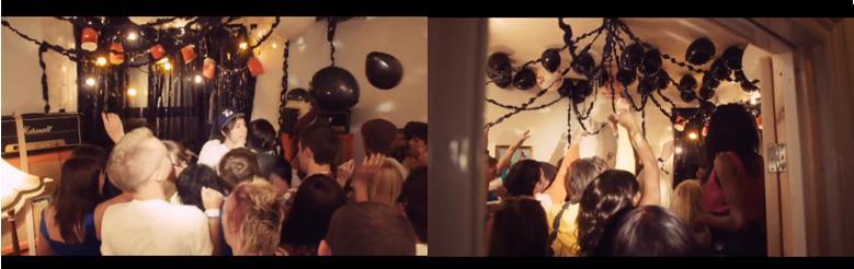


They have created a realistic party atmosphere by filling a large room of people, and adorning it with party decorations such as balloons and confetti. The mess created by the party goers, consisting of food, drink and even toilet paper gives the impression that it is well into the party. This would explain the energetic audience. Furthermore the camera movements also reflect the music, as it is handheld throughout, regularly moving with the beat.

Tuesday, 15 December 2009

Music Video Analysis - Just Dance:

Over the past year Lady Gaga has become one of the biggest stars in pop, being credited in the same vein as the likes of Madonna and Kylie. This is not only down to her undeniably infectious songs; it is also a result of the iconic image she has built via her live appearances and music videos. Just Dance was the first of Lady Gaga’s music videos and introduced us to a super star in the making.

The premise of the video is a house party which has got a bit out of hand and as the lyrics say everyone has had ‘a little bit too much’. Gaga then turns up on the scene and gets the party going again by telling everyone to ‘Just Dance’. It is a simple concept, but it is executed brilliantly in this chaotic video. The setting isn’t exactly glamorous; it is a pretty standard house. However the mise- en-scène including the furnishings and décor lend it a certain edge that makes it believable that someone of Gaga’s stature would be welcome. Furthermore the remainder of the party goers are young and beautiful, which is a common convention of this sort of music videos. Rarely do you get ‘ugly’ and ‘old’ people in pop/ dance videos.

The video begins with shots of the remaining of the party. I.e. close ups of people laying on the floor, scattered about making the place look untidy, and then Lady Gaga turns up, and the juxtaposition between her bright pink coat, and the not so colourful setting, puts emphasis on her as the star. The video continues to show close ups of the devastation, and then the audience are greeted with a wide shot to show the full extent of the mess. These are inter cut with shots of Lady Gaga thrusting away in a separate room alone. This creates sense of voyeurism.


As Gaga begins to sing there are more close ups of just her face. Including one of her with a blue lightning bolt across her eye this has since become one of Gaga's many iconic fashion statements. Immediately she is a recognisable figure. Gaga’s performance throughout the video is very sexually orientated; again this would be a convention of the genre. It is pleasing to the eye and encourages audiences to dance and enjoy themselves whilst listening. Some scenes are very sexually suggestive, i.e. the lesbian kiss. However they are approached with caution and in that case the scene is cut just before they kiss. This is the sort of music that has mainstreams appeal, and there will be lots of young children watching. Lady Gaga should not abuse her power as a role model. Consequently the video has to be relatively family friendly, yet glamorous and risky at the same time.


The lyrics often reflect what is being portrayed on screen. The lyrics are very self explanatory, and it is hard to interpret them in any other way apart from the scenes in this video. Examples include ‘where are my keys? I lost my phone?’ these lyrics are accompanied by a shot of someone looking for their phone and keys. Moreover when Lady Gaga starts to sing the lines ‘Half psychotic, sick, hypnotic’ there are shots of the party goers going a little ‘psychotic’ and lightly beating each other with the furnishings.


The video is comprised of many shots, it is constantly changing. This helps maintain the viewer’s attention. The editing is fast paced to reflect the pace of the song, and it speeds up/slows down respectively with the music. Also it features a lot of montages, which are common in music videos. It is difficult to make out exactly what is being shown, but that is the pleasure of watching a music video like this; it asks for repeated viewings so viewers can catch what they missed before.

In conclusion this is a perfect example of a pop video. There are many close-ups of the artist, beautiful, young people dancing, fast paced editing, montages and a female star who holds the whole thing together. Additionally it illustrates that as long as these factors keep the viewers distracted the setting doesn’t necessarily have to be glamorous. It could be shot in an ordinary house and still look amazing.

Andrew Huang's 'Doubt':


When we first decided to choose this song there wasn't a released video. But here it is, it was premiered recently, and we were shocked to see how abstract it was. It couldn't be further away from our treatment. Directed by a little know Andrew Huang who is renowned for his complex short films. This is his fourth outing as a music video director. He certainly lives up to his reputation, this is not your run of the mill band performance or narrative based short film. This shares more similarities with a piece of art than a music video; the strange sculptures and visuals are something you would expect to see at an exhibition at the Tate modern. Huang is obviously content with breaking conventions.

The video displays an exceptional use of editing and lighting to reflect the pace and tone of the music. The mise-en-scène featured in this video is very simplistic, and it is left to the mystical shapes when Huang finally adds his touch. Although it is confusing, and makes almost no sense at all, it is visually exciting. The lighting is constantly changing with the music, and the vibrant colours used work to great effect, lending to the electronic genre of Delphic.

The actors used in the video are conventionally good looking, and for the duration of the video almost half naked. This also lends to the electronic genre. The song is an unconventional dance number. It is common for dance videos to exploit the human body, and show a lot of skin. I would normally expect these 'good looking' people to be dancing away so that their toned bodies were emphasised. Where this video differs the stars are stationary throughout either sitting on a plain white box or standing up right. Additionally their bodies are gradually covered by the shapes featured. This could be a spin on the dance music genre, and act as a statement against the exploitation of the human body (notably females) in dance music videos. However that is pulling at thin air, the video is so abstract it could be representing almost anything, and it may only be the director who truly understands the concept behind it.

The fast paced electronic slurs of the track are often accompanied by fast paced editing, in the form of neon lights and cuts of the several actors' featured. However for most of the video the editing is relatively slow paced, along with the very slow movements between the star's and the slow build up of shapes. This acts as juxtaposition to the fast paced song. It isn't until the musical bridge near the end of the song that the editing and lights act as a true reflection of the song's pace. The lights dominate and chase their way across the screen in a visual spectacular building up to the song's climax.

Despite this being the first of Delphic's videos to be directed by Huang, their other two; 'Counterpoint' and 'This Momentary', are similar in terms of abstract visuals, simplistic settings and slow paced editing. Additionally the band are not featured in any of their videos, which gives them an anonymity, and being a small, up and coming band, it leaves more to the imagination. Furthermore it lets viewers concentrate more on the music.
Whether this trend will continue in Delphic's career, and become an iconic trait associate with their videos it is unsure. The videos may look incredible, but music videos are commonly used as a promotional tool, therefore often feature close ups of the artists in question. Where Delphic are never seen it could prove disadvantageous. Leaving them to rely heavily on word of mouth, which is something Delphic are almost certainly familiar with; coming third in BBC's Sound of 2010 poll and just missing out on the BRIT's critic choice award to Ellie Goulding. 2010 could well and truly be Delphic's year.