

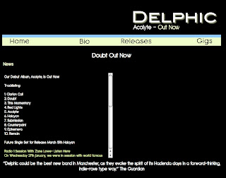
This is the first draft of our ancillary task of making a website to accompany the promotional video. It has several flaws, including the text and overall layout. Furthermore it was lacking some essential website links, such as a log in page, gallery, etc.
 Firstly I created this logo for the album artwork, and to maintain a band identity we translated this logo over to the web page.
From the offset we had collectively decided to include the video and below an album advert in the remaining space on the right hand side. The initial idea for the album advert came from an album advert I saw on Two Door Cinema Club's' homepage. Their advert features a close up of the main image on their album artwork which features the crowned cat; this is adjacent to the name of their album which fades in and out to show the band's name, the name of the album and where you can purchase it.
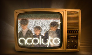
We took inspiration from this concept, and tried to apply to our front cover. Initially we thought about doing almost an exact copy with the Television to the right of the advert featuring a blurred image of the band, and then the album name ('Acolyte') and then 'out now' fading in and out. However seeing as though the image was a television in itself, we decide to manipulate this, and feature all the information and images on the static television screen itself.
Although it is not visible here upon entering the website the television turns on, then becomes static before a picture of the band appears with the title 'acolyte'( which you can see below on the image at the bottom) this then fades into the words 'out now' and this repeats itself if you remain on the home page. Additionally it acts as a link to purchase the album from amazon.co.uk

In addition from the existing website research we did Sam added conventional links, such as; Gallery, Bio, Releases and a sign up section. Consequently he included a log in section below the links tab, where existing members can post comments on updates if it was an existing website.
Furthermore a criticism of the previous home page was that in the updates section each update wasn't clearly separated from each other as they were all in white. In contrast we changed the colour scheme of the updates to match the links tab. The date of each post is in blue and the information is in green, moreover any links are in white, so it is easy for audiences to navigate their way through the page.



Valuable posting
ReplyDeleteI am so glad this internet thing works and your article really helped me
A pro-IT government which supports the growth of IT in this country and formulates policies around it.
Web Development Firm India