Initially I went there wanting a standard image of the band in a variety of poses that would enable us to manipulate and blur the image, to give an effect similar to the Horrors album cover 'Primary Colours'(as seen below).
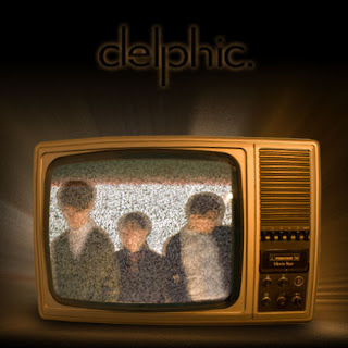
 We started taking various different shots, changing the lighting with each, where we got to a point where just decided to take the picture whilst moving the camera and this gave us the blurred effect in the image of the band below. Furthermore Jordan had an old fashioned disused television set, and we thought it would make a good image wherever we put it. So we took photos of the television on static. When we got back to Photoshop we decided on the concept of placing the band on the television set, blending us in with the static. Additionally we placed this onto a black background and added an outward glow using a guassian effect of the television giving off light.


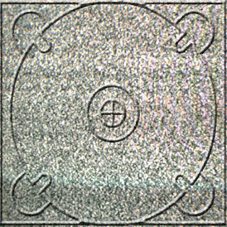
Below is the inside CD tray this was created by cropping the static from the static from the television and copying it to the shape of a panel. I then found a CD tray template from the Internet and gave it a bevel and emboss effect to make it look 3D.
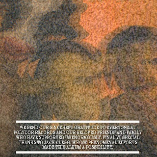
 On the photo shoot, we took several photos of us in these animal masks, as well as the masks on their own. This is a recurring theme throughout the promotion package, with the masks featuring heavily in the video. Here we used this photo for the inside panel opposite the CD tray. All we did was blur the image and then place it into the static from the television again. Moreover include a section at the bottom thanking people.
 Finally we had to do the back panel which would feature the track listing; initially we thought we'd have a black background similar to the album artwork, with the track listing in white and then the picture below to the left of it. However when we copied the image onto the track listing document we were left with a close up of Sam's neck, and we thought it looked quite good, and certainly more intriguing and interesting than are initial idea. However we moved the picture around to see if there were any other views available and we found a nice close up of the bottom half of mine and Jordan's face. We then showed Mrs McLuckie both option and she preferred the latter, which is the one we have consequently chose. In addition we changed the colouring of the photo and made it more orange so it blended well with the colour of the television on the art work.


No comments:
Post a Comment