 Above is a new album artwork design. We decided to steer away from the Spiro graph idea, as it was considered too simplistic; it didn't particularly show off any photo shop skills. In addition there was no sign of the band involved. Whereas here we have a blurred image of the band in question.
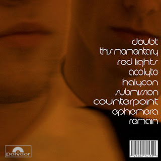
 Furthermore we have taken another image of the band to use on the reverse of the digipak. Previously it was a plain black background which featured a glowing track listing centred. Here we have removed the glow and moved the track listing to right. It is a close up image of two members of the band. We changed the colouring of the photo, so it blended in well with the glow on the front cover.
 Here is the inside panel of the digipak, which will be opposite the disc tray. The crackling television used on the front cover inspired us to create this effect on photo shop, over a photo of the band wearing animal masks. The image is distorted, and it isn't clear what is actually on view here. This should be intriguing to the audience.
After completing digipak research found that on the inside cover there are usually some form of acknowledgments. We have including a 'Special thanks' section at the bottom, which is clearly highlighted via the white text and border lines.
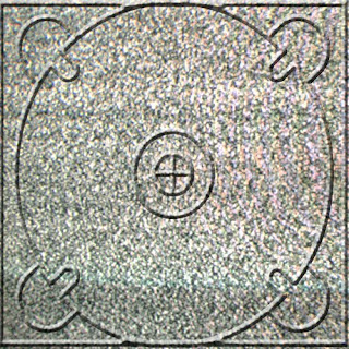
 Above is the second inside panel which features a disc tray, to hold the CD. This is the most minimalistic of the four panels, as it is just static from a TV covering the whole panel. This continues the television theme of the digipak.

No comments:
Post a Comment