
Wednesday 17 March 2010
Evaluation 3 - What have you learned from your audience feedback?
Once we had completed a rough cut of our video we organised a target audience screening in the media room, we inviting along various people in the sixth form who best represented a sample of the target audience specified in the previous blog post 'Target Audience'. We wanted an audience that had previously not seen or did not know the contents of the video, in order to get a non-biased reaction.
Here are photos from the screening:
 After screening the video we picked a select handful to come and give an interview about the video. We did this in groups of two. We asked the following questions:
- What were your initial thoughts?
- Were you shocked by the ending?
- Do you think the visuals correspond with the chosen song?
- What do you think are the positive aspects?
- What do you think are the negative aspects?
- If anything, what would you change about the video?
We then edited the interviews together with the corresponding video. See below:
Audience Feedback - Rough Cut 2 from WGSB on Vimeo.
The audience feedback was generally favourable, with each interviewee praising the video. However this may have been down to politeness. But it wasn't all niceties there was some constructive criticism.
Elements people particularly enjoyed were the strobe party scenes, and the fast paced editing, as well as the setting and casting. Furthermore the subtle hints throughout to the shocking finale. On the other hand some people felt that the animal masks and the inclusion of the younger boy was confusing, and seemed 'too random' at times.
This feedback helped to tweak our video slightly, with the inclusion of more quick cuts, to break up the long monotonous scenes such as Jack getting dressed and going to the bathroom. However this was something already picked up on by Mrs. McLuckie. The main conclusion we drew from this research was that the video was a product that appealed to the target audience, all the viewers were pleases with our efforts. Perhaps it was a narrative some could relate to, or perhaps it acted as escapism. We tried to encapsulate a Skins-esque teenage drama within the space of 3 minutes, and we hope this has been achieved.
On completion of the final cut Jordan put a link to the video on facebook, to get further feedback from the target audience.

'I liked it. Editing to the beat can be tricky when trying to hold up a narrative. But you pulled it off by using constant "flash back" clips. Also, the picture in picture effect contained just the right amount of shots. Overloading the viewer with information can draw attention away from the narrative flow.
The reference to the child, suggesting a forgotten innocence within the character, tied in well with the video's portrayal of todays youth.
Overall, the sequence included some well thought out editorial decisions and I was happy to see normal cuts, rather than quick fix transitions.
I give the Prodigy parody a 80%, I deducted 20% due to indieness.'
It was great to receive feedback from a professional. Here he has picked up on The Prodigy video 'Smack My Bitch Up' which acted as a great influence in the narrative and filming of our video. In addition he compliments the fast paced editing, and inclusion of the young boy as juxtaposition with his elder self.
In conclusion the feedback helped us fine tune are video and build it into the finish product that it is now. Feedback early on, when we had a first rough cut, helped significantly move away from our original idea, to something more innovative and interesting.
Evaluation 2 - How effective is the combination of your main product and ancillary texts?
This video outlines how we have tried to maintain a consistent house style over all three platforms; the video, digipak and website.
Evaluation 2 from Jack Osman on Vimeo.
Script:
Jack: We have produced a series of products, including a music video, website and digipak to promote the release of an album by the band Delphic.
There are several themes and images explored throughout each of our tasks that maintain a consistent house style.
Sam: The main video is a narrative based affair that follows a morning after, the night before scenario where the lead protagonist; Jack has regretted or doubted sleeping with someone. This of course resonates with the title of the song; ‘Doubt’.
Louisa: Both the digipak and video explore the theme of confusion, and hiding your true identity. This is represented via the use of animal masks. In the video this theme is explored more explicitly with Jack masking his homosexual feelings; in attempt trying to convince himself he is heterosexual before coming to terms with the truth.
Jordan: In the digipak the masks are used on the inside sleeve opposite the disc tray, this is to hide the identity of the band itself. This is something we have consciously decided to do, in order that there is more emphasis on the band’s music rather than image. Additionally it creates an air of mystery surrounding the band, which may intrigue potential audiences.
Jack: The fact that Jack masks his homosexuality is referenced throughout our video in a variety of manners. Most notably in the scene where he looks up into a mirror to be haunted by the image of himself wearing a bear’s mask. The split personality in the mirror represents the trouble he is having choosing his sexual orientation.
Sam: The video culminates with Jack battling through several party goers adorned in the aforementioned masks, as the feelings of paranoia and regret take over Jack tries to escape the clutches of scene of the incident by running towards the front door. Upon opening the front door he comes face to face with his ‘one night stand’ and finally accepts his homosexuality.
Louisa: The theme of bright, neon lights is continued throughout all three promotional products. In the video this obviously applies to the shots of the strobed party.
Jordan: On the digipak the television dominates the album artwork with a bright glow, to illuminate the image and the presence of the band. Furthermore the links tab and the updates section on the website are coloured in bright green and blue thin strips representing neon lights. This theme ties in well with the electronic genre of the music.
Video referenced: Lady Gaga - Telephone
Tuesday 16 March 2010
Monday 15 March 2010
Individual Responsibilities:
Making our promotion package for Delphic's 'Doubt' consisted of three main processes, research, filming and editing. The research was completed by every one of us, each browsing the Internet and YouTube for ideas, of shots, angles, etc. As well as looking at existing band websites and digipaks, we shared the workload, and as a result shared the information we found on each other's blogs.
We were all involved in the creative side; developing the concept. I found myself constantly writing down and sketching ideas then pitching them to the rest of the group. Once we had decided what exactly we wanted from the video, I had a significant role in planning each shot, and how the video would plan out. This of course lent to the role of director in the filming process. I had a critical role of telling our lead actor what to do and where to go whilst filming. In addition I had a role in the video itself, and although I do not have much screen time, there are a lot of point of view shots from my perspective. I tried to be behind the camera as much as possible when I was acting in it; I shared this duty with Jordan and Sam. Louisa was in control of the lighting, and did an effective job of making sure each shot would translate well onto screen.
Post filming me and Louisa had a small hand at the editing, but Jordan took the main role of editor, proving to be the most successful in the group. At the start of the editing process we tried all sitting around the screen taking turns and helping each other. Consequently there were conflicting ideas and visions, and it became an easier process with just Jordan taking the reins. I constantly overlooked the editing, lending help and constructive criticism where appropriate. Towards the end of the editing process, Sam had a go at editing; manipulating the footage we got from our last shot.
Sam had previously worked with dream weaver in IT, therefore he had main responsibility in the making the website. The rest of us gave him ideas, including colour schemes, font, layout, etc. and again I was always there to lend a helping hand or give him any ideas.
The digipak was created primarily by me and Sam, however Louisa did come up with some great concepts and visualisations; she was the photographer for all of the images we used on the digipak, because the remaining three of us featured in the band.
Sunday 14 March 2010
Teacher Feedback (Rough Cut 2):
Our second rough cut was generally well received by Mrs. McCluckie in comparison to the rest our efforts, most notably our first attempt at a rough cut. The change from Jack miming in the verses to more narrative based scenes was seen as a vast improvement. This rough cut however is by no means perfect, and we know that. Scenes Miss did pick up on include;
- The shots of the two of us holding hands reveals that it is a homosexual love affair too early on, due to the hair on my arm. Therefore that needs to be re-filmed.
- The scenes whereby Jack gets up to go to the bathroom and where he is getting dressed are too long and monotonous. We planned to rectify this by breaking these shots up with a variety of cuts, featuring the party or flashbacks.
In addition there are a few shots we don't personal like and some of the editing needs tweaking, but apart from that it seems we are finally near the end of the process.


Website Final:
Here is a link to our website (warning: it is password protected):

Below is a screen shot of the homepage:


Saturday 13 March 2010
Production Schedule:
 This is a full production schedule of each day we filmed, and what we filmed that day.
Website Development:


This is the first draft of our ancillary task of making a website to accompany the promotional video. It has several flaws, including the text and overall layout. Furthermore it was lacking some essential website links, such as a log in page, gallery, etc.
 Firstly I created this logo for the album artwork, and to maintain a band identity we translated this logo over to the web page.
From the offset we had collectively decided to include the video and below an album advert in the remaining space on the right hand side. The initial idea for the album advert came from an album advert I saw on Two Door Cinema Club's' homepage. Their advert features a close up of the main image on their album artwork which features the crowned cat; this is adjacent to the name of their album which fades in and out to show the band's name, the name of the album and where you can purchase it.


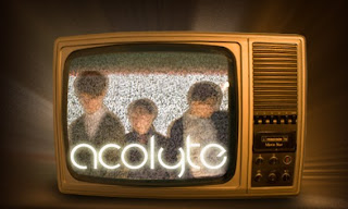
We took inspiration from this concept, and tried to apply to our front cover. Initially we thought about doing almost an exact copy with the Television to the right of the advert featuring a blurred image of the band, and then the album name ('Acolyte') and then 'out now' fading in and out. However seeing as though the image was a television in itself, we decide to manipulate this, and feature all the information and images on the static television screen itself.

Although it is not visible here upon entering the website the television turns on, then becomes static before a picture of the band appears with the title 'acolyte'( which you can see below on the image at the bottom) this then fades into the words 'out now' and this repeats itself if you remain on the home page. Additionally it acts as a link to purchase the album from amazon.co.uk

In addition from the existing website research we did Sam added conventional links, such as; Gallery, Bio, Releases and a sign up section. Consequently he included a log in section below the links tab, where existing members can post comments on updates if it was an existing website.
Furthermore a criticism of the previous home page was that in the updates section each update wasn't clearly separated from each other as they were all in white. In contrast we changed the colour scheme of the updates to match the links tab. The date of each post is in blue and the information is in green, moreover any links are in white, so it is easy for audiences to navigate their way through the page.

Thursday 11 March 2010


Wednesday 10 March 2010
Digipak Stages:
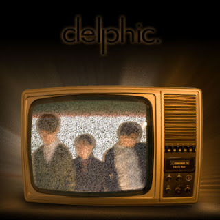
The first stage of the digipak was to create an album artwork; in previous posts you may have seen our previous Spiro graph idea. However this was perceived to be too simple, and the fact that there was no band didn't follow the conventions of a digipak and it was even more essential seeing as though we don't have a band in our video. Therefore we all went to Jordan's house where he has a small band practice room outside which features white walls. We thought this would be a perfect place to take shots of our band.
 We started taking various different shots, changing the lighting with each, where we got to a point where just decided to take the picture whilst moving the camera and this gave us the blurred effect in the image of the band below. Furthermore Jordan had an old fashioned disused television set, and we thought it would make a good image wherever we put it. So we took photos of the television on static. When we got back to Photoshop we decided on the concept of placing the band on the television set, blending us in with the static. Additionally we placed this onto a black background and added an outward glow using a guassian effect of the television giving off light.


Below is the inside CD tray this was created by cropping the static from the static from the television and copying it to the shape of a panel. I then found a CD tray template from the Internet and gave it a bevel and emboss effect to make it look 3D.
 On the photo shoot, we took several photos of us in these animal masks, as well as the masks on their own. This is a recurring theme throughout the promotion package, with the masks featuring heavily in the video. Here we used this photo for the inside panel opposite the CD tray. All we did was blur the image and then place it into the static from the television again. Moreover include a section at the bottom thanking people.

 Finally we had to do the back panel which would feature the track listing; initially we thought we'd have a black background similar to the album artwork, with the track listing in white and then the picture below to the left of it. However when we copied the image onto the track listing document we were left with a close up of Sam's neck, and we thought it looked quite good, and certainly more intriguing and interesting than are initial idea. However we moved the picture around to see if there were any other views available and we found a nice close up of the bottom half of mine and Jordan's face. We then showed Mrs McLuckie both option and she preferred the latter, which is the one we have consequently chose. In addition we changed the colouring of the photo and made it more orange so it blended well with the colour of the television on the art work.


Initially I went there wanting a standard image of the band in a variety of poses that would enable us to manipulate and blur the image, to give an effect similar to the Horrors album cover 'Primary Colours'(as seen below).
 We started taking various different shots, changing the lighting with each, where we got to a point where just decided to take the picture whilst moving the camera and this gave us the blurred effect in the image of the band below. Furthermore Jordan had an old fashioned disused television set, and we thought it would make a good image wherever we put it. So we took photos of the television on static. When we got back to Photoshop we decided on the concept of placing the band on the television set, blending us in with the static. Additionally we placed this onto a black background and added an outward glow using a guassian effect of the television giving off light.


Below is the inside CD tray this was created by cropping the static from the static from the television and copying it to the shape of a panel. I then found a CD tray template from the Internet and gave it a bevel and emboss effect to make it look 3D.
 On the photo shoot, we took several photos of us in these animal masks, as well as the masks on their own. This is a recurring theme throughout the promotion package, with the masks featuring heavily in the video. Here we used this photo for the inside panel opposite the CD tray. All we did was blur the image and then place it into the static from the television again. Moreover include a section at the bottom thanking people.
 Finally we had to do the back panel which would feature the track listing; initially we thought we'd have a black background similar to the album artwork, with the track listing in white and then the picture below to the left of it. However when we copied the image onto the track listing document we were left with a close up of Sam's neck, and we thought it looked quite good, and certainly more intriguing and interesting than are initial idea. However we moved the picture around to see if there were any other views available and we found a nice close up of the bottom half of mine and Jordan's face. We then showed Mrs McLuckie both option and she preferred the latter, which is the one we have consequently chose. In addition we changed the colouring of the photo and made it more orange so it blended well with the colour of the television on the art work.


Shooting Schedule 4:
Monday 15th March
Hopefully this will be our final shoot. Here we expect to film the remaining shots, which include;
Flashbacks:
- Jack getting dragged out of the strobe party (my POV).
- Jack being led upstairs (my POV).
- People smoking outside and then Jack being offered drugs by a man in an animal masks.
- Jack taking the drugs, in pill form.
- Jack back in party dancing away in a hallucination state, with everyone surrounded round him staring.
- Argument/fight in the party involving Jack.
Verses:
- Jack going downstairs in the early hours of the morning after getting dressed, to find party goers scattered about, in an untidy fashion.
- Jack walking to the kitchen to make himself a drink, but is trembling in a state of shock. Someone comes up to him to see if he is alright, Jack then looks up and they are wearing an animal mask.
- Jack rushing out to the corridor to be greeted by four party goers draped in animal mask, surrounding him, until it becomes too much for Jack and he storms out of the house.
- Jack then walking outside across the road to get hit by a car.
Tuesday 9 March 2010
Digipak New Idea:
 Above is a new album artwork design. We decided to steer away from the Spiro graph idea, as it was considered too simplistic; it didn't particularly show off any photo shop skills. In addition there was no sign of the band involved. Whereas here we have a blurred image of the band in question.
 Furthermore we have taken another image of the band to use on the reverse of the digipak. Previously it was a plain black background which featured a glowing track listing centred. Here we have removed the glow and moved the track listing to right. It is a close up image of two members of the band. We changed the colouring of the photo, so it blended in well with the glow on the front cover.
 Here is the inside panel of the digipak, which will be opposite the disc tray. The crackling television used on the front cover inspired us to create this effect on photo shop, over a photo of the band wearing animal masks. The image is distorted, and it isn't clear what is actually on view here. This should be intriguing to the audience.
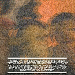
After completing digipak research found that on the inside cover there are usually some form of acknowledgments. We have including a 'Special thanks' section at the bottom, which is clearly highlighted via the white text and border lines.
 Above is the second inside panel which features a disc tray, to hold the CD. This is the most minimalistic of the four panels, as it is just static from a TV covering the whole panel. This continues the television theme of the digipak.
Wednesday 3 March 2010
Digipak Development:
The digipak will have to feature 4 or 6 sides. We already have a front panel which is the album artwork below:
 The panels we need are two inside one with disc tray feature and a back panel with album track listing. Here is a rough design of the back:
 The design is very simple to mirror the album artwork. we still have album credits to include at the bottom. The problem is that there is a lot of plain black space, so it may be changed.
Here is what both panels look like together with a joining side panel; complete with album name and artist.

Sunday 28 February 2010
Digipak Research:
Here is an example of a 4 sided digipak:

Below are the two inside panels of the digipak, these act as sleeves for the CD and a booklet for the album. Both feature a landscape photo of the band, with the left side including credits.

Here is the reverse of the digipak, featuring the track listing.

This is an example of an eight sided digipak:

The track listing.

Two of the four inside panels featuring two iconic images of The Smiths.

The four inside panels, the two middle panels featuring CD trays for the double disc album. behind the Cd features various album artwork by The Smiths.
 We have decided to produce a four panel digipak. One front cover for the album artwork, one reverse side for album track listing, an inside panel featuring a photo of the band and another featuring a tray for a disc.
Saturday 27 February 2010
Prodigy - Smack My Bitch Up:
Warning- The video contains nudity, sex and violence.
This is the controversial video to The Prodigy's Smack My Bitch Up, getting banned from various television stations including MTV the unedited version features drug abuse, hit and run incident, violence, nudity and sex. Despite the controversy it is considered by some to be one of the best music videos of all time, and I certainly agree. With a twist that will continue shock viewers forever. But ultimately it is the brilliant first person point of view camera work that makes it so brilliant.
This style of camera work which is maintain throughout the whole video, keeps the identity of the protagonist hidden, and it is only until the end when a woman is revealed in a mirror that the viewers finally realise the shocking truth. It is assumed up until that point that the protagonist is a male, with the laddish behaviour; drinking, taking drugs, being reckless and violent. The ending breaks stereotypes.
The problem with our video at the moment is that we haven't kept the identity of the person our protagonist secret, therefore we have lost the shocking homosexual ending that first attracted us all to the idea. When we re-shoot our video, it will be our aim to keep the identity of the secret partner (ie. Me) hidden at all costs. Whether this be via a series of point of view shots or other clever camera work. In addition it is the behaviour of the lead in Smack My Bitch Up that makes the ending all the more shocking, in our case I would have to act like a female to mirror the same sort of idea, and leave the audience thinking this is just an ordinary one night stand.
Thursday 25 February 2010
Shooting Schedule 3:
Monday 1st March
On this day we plan to film everything we possible explained in the 'teacher feedback 3' post that includes just the protagonist (Jack Clegg) and his mysterious lover (Me). This will be the bulk of verse one and part of verse 2, as well as almost all of the flashback scenes.
Shots we need include:
For the verses:
- Jack waking up to discover what he has just done. ie. Look down at a pile of clothes and a condom.
- Leaving the bedroom to go to the bathroom
- Looking at himself in the bathroom mirror to see a bear mask stare back at him.
- Shower scene, Jack 'washing away the guilt'.
- Coming back to his bedroom to get dressed.
Flashbacks (all from my point of view):
- Jack being pushed onto his bed by me.
- Undressing each other.
- Various different sexually suggestive positions, without revealing my identity.
Teacher Feedback (Rough Cut):
The footage we got from the 10/02/10 helped us make a short rough cut. We made the verses more interesting by adding in various small montages, relating to the sexual act that took place. In addition Jordan edited together a chorus which featured Todd Cook and Jack Clegg miming the chorus. Here he used various different editing techniques to make it less monotonous, which was one of Mrs. McLuckie's main criticisms of our previous footage. He did this via a variety of split screen shots and by quickly swapping the camera angles, to give it a distorted effect.
We then showed Mrs. McLuckie, and let's just say she was less than pleased with our efforts. Reviewing the whole video again she basically scrapped all our footage. Criticisms included; Jack's performance was not good enough, the lighting was bad, the shots were too static, in some cases there was too much going on and the party scenes were not executed well by various party goers ruining the shot by jumping up and down behind the protagonist. However she did like the juxtaposition of the young boy and Jack, and the use of split screen editing.
It was a shock to all of us we thought that we were on the right lines, and with the deadline in four weeks it was a massive push back. But of course Mrs. McLuckie knows what she is talking about, and it is her opinions that will help us achieve the A grade us all so desperately want. The consensus was that we had a great idea, but have not really executed it well. So it was back to square one, we had to rethink the whole video.
The first thing we unanimously decided was to scrap Jack miming the verses completely and fill them with narrative based shots. But keep him miming on the chorus, which will focus more on the young boy segments. Now the story will focus more on the morning after, or just hours after the protagonist has had sex. Therefore it will be him waking up, slowly realising what he has done, and soon regretting his actions.
He will wake up to be greeted with the sight of clothes on the floor and a condom wrapper, clearly illustrating what has just happened. Consequently he tries to relax himself with a cigarette, and then goes into the bathroom to cleanse himself thoroughly. Before getting dressed and making his way downstairs to the after effects of a party, so people clambered over the floor, mess and drink everywhere. Upon seeing who he has just slept with he goes crazy breaks out the house, collapses outside the front door in a crying state, consequently leading to the last scene which will see him reunited with his one night stand, and conclude on an image of the two kissing. All this will be in twined with short flashback shots of the night before, as well as random images, which we have used previously.
Initially the idea was that the protagonist was going to storm out of the house running down the street before collapsing, and then being faced with his one night stand. However Mrs. McLuckie ruled this out, because rarely does a scene featuring running work out well, and it would be extremely hard to film. Therefore we tweaked the ending slightly. Furthermore Miss picked up on several shots which featured animal masks, and it was suggested that this should be presented as one of the main themes of the video. Initially the masks were meant to represent the fact that the person the lead sleeps with is unknown, as well as the protagonists hidden identity as a homosexual. It still will, and we will try and nod at the masks in each scene, whether it is subtle with the mask just resting on the bed, or Jack looking in the mirror to see himself with a mask on.
Another criticism of our video was that there wasn't a given style; the lighting constantly seemed to fluctuate, so on the next shoot we will try to maintain a continuous lighting pattern that will reflect the mood of the story. Also we need to film more of the young boy scenes, so it makes more sense to the viewer as to what is going on, as well as maintaining the juxtaposition with the protagonist.
Wednesday 24 February 2010
Rough Cut:
This is a basic rough cut of the first verse and chorus.
Doubt Rough Cut 1 from Jack Osman on Vimeo.
Friday 12 February 2010


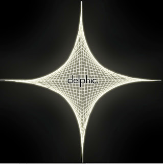
Album Artwork First Draft:
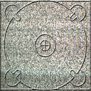
 This is the first draft of our album artwork. We placed an outer glow around the Spiro graph. It is very simple, just white on black; however the complexity of the actual Spiro graph gives it a 3D feel. Furthermore the logo I designed is illuminated in the middle of the Spiro graph. I have kept the logo small, so it is subtle yet still eye catching. At the moment the album name 'Acolyte' is not present, this may remain to be the case, and just include it on the side of the digipak.
Subscribe to:
Posts (Atom)