Wednesday, 17 March 2010
Evaluation 3 - What have you learned from your audience feedback?
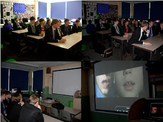 After screening the video we picked a select handful to come and give an interview about the video. We did this in groups of two. We asked the following questions:
- What were your initial thoughts?
- Were you shocked by the ending?
- Do you think the visuals correspond with the chosen song?
- What do you think are the positive aspects?
- What do you think are the negative aspects?
- If anything, what would you change about the video?
Audience Feedback - Rough Cut 2 from WGSB on Vimeo.
The audience feedback was generally favourable, with each interviewee praising the video. However this may have been down to politeness. But it wasn't all niceties there was some constructive criticism.
Elements people particularly enjoyed were the strobe party scenes, and the fast paced editing, as well as the setting and casting. Furthermore the subtle hints throughout to the shocking finale. On the other hand some people felt that the animal masks and the inclusion of the younger boy was confusing, and seemed 'too random' at times.
This feedback helped to tweak our video slightly, with the inclusion of more quick cuts, to break up the long monotonous scenes such as Jack getting dressed and going to the bathroom. However this was something already picked up on by Mrs. McLuckie. The main conclusion we drew from this research was that the video was a product that appealed to the target audience, all the viewers were pleases with our efforts. Perhaps it was a narrative some could relate to, or perhaps it acted as escapism. We tried to encapsulate a Skins-esque teenage drama within the space of 3 minutes, and we hope this has been achieved.
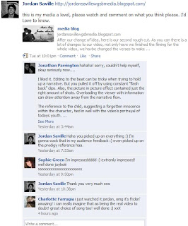
On completion of the final cut Jordan put a link to the video on facebook, to get further feedback from the target audience.
The reference to the child, suggesting a forgotten innocence within the character, tied in well with the video's portrayal of todays youth.
Overall, the sequence included some well thought out editorial decisions and I was happy to see normal cuts, rather than quick fix transitions.
I give the Prodigy parody a 80%, I deducted 20% due to indieness.'
Evaluation 2 - How effective is the combination of your main product and ancillary texts?
Evaluation 2 from Jack Osman on Vimeo.
There are several themes and images explored throughout each of our tasks that maintain a consistent house style.
Sam: The main video is a narrative based affair that follows a morning after, the night before scenario where the lead protagonist; Jack has regretted or doubted sleeping with someone. This of course resonates with the title of the song; ‘Doubt’.
Louisa: Both the digipak and video explore the theme of confusion, and hiding your true identity. This is represented via the use of animal masks. In the video this theme is explored more explicitly with Jack masking his homosexual feelings; in attempt trying to convince himself he is heterosexual before coming to terms with the truth.
Jordan: In the digipak the masks are used on the inside sleeve opposite the disc tray, this is to hide the identity of the band itself. This is something we have consciously decided to do, in order that there is more emphasis on the band’s music rather than image. Additionally it creates an air of mystery surrounding the band, which may intrigue potential audiences.
Jack: The fact that Jack masks his homosexuality is referenced throughout our video in a variety of manners. Most notably in the scene where he looks up into a mirror to be haunted by the image of himself wearing a bear’s mask. The split personality in the mirror represents the trouble he is having choosing his sexual orientation.
Sam: The video culminates with Jack battling through several party goers adorned in the aforementioned masks, as the feelings of paranoia and regret take over Jack tries to escape the clutches of scene of the incident by running towards the front door. Upon opening the front door he comes face to face with his ‘one night stand’ and finally accepts his homosexuality.
Louisa: The theme of bright, neon lights is continued throughout all three promotional products. In the video this obviously applies to the shots of the strobed party.
Jordan: On the digipak the television dominates the album artwork with a bright glow, to illuminate the image and the presence of the band. Furthermore the links tab and the updates section on the website are coloured in bright green and blue thin strips representing neon lights. This theme ties in well with the electronic genre of the music.
Tuesday, 16 March 2010
Monday, 15 March 2010
Individual Responsibilities:
Sunday, 14 March 2010
Teacher Feedback (Rough Cut 2):
- The shots of the two of us holding hands reveals that it is a homosexual love affair too early on, due to the hair on my arm. Therefore that needs to be re-filmed.
- The scenes whereby Jack gets up to go to the bathroom and where he is getting dressed are too long and monotonous. We planned to rectify this by breaking these shots up with a variety of cuts, featuring the party or flashbacks.
Website Final:
Saturday, 13 March 2010
Website Development:


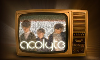
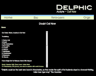 Firstly I created this logo for the album artwork, and to maintain a band identity we translated this logo over to the web page.
Thursday, 11 March 2010
Wednesday, 10 March 2010
Digipak Stages:
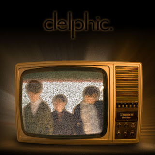
 We started taking various different shots, changing the lighting with each, where we got to a point where just decided to take the picture whilst moving the camera and this gave us the blurred effect in the image of the band below. Furthermore Jordan had an old fashioned disused television set, and we thought it would make a good image wherever we put it. So we took photos of the television on static. When we got back to Photoshop we decided on the concept of placing the band on the television set, blending us in with the static. Additionally we placed this onto a black background and added an outward glow using a guassian effect of the television giving off light.

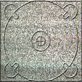
Below is the inside CD tray this was created by cropping the static from the static from the television and copying it to the shape of a panel. I then found a CD tray template from the Internet and gave it a bevel and emboss effect to make it look 3D.
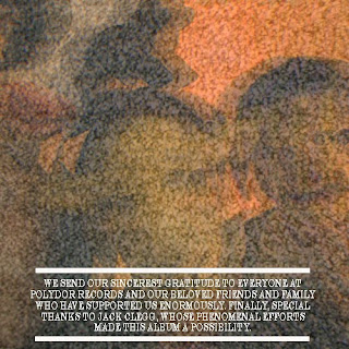
 On the photo shoot, we took several photos of us in these animal masks, as well as the masks on their own. This is a recurring theme throughout the promotion package, with the masks featuring heavily in the video. Here we used this photo for the inside panel opposite the CD tray. All we did was blur the image and then place it into the static from the television again. Moreover include a section at the bottom thanking people.
 Finally we had to do the back panel which would feature the track listing; initially we thought we'd have a black background similar to the album artwork, with the track listing in white and then the picture below to the left of it. However when we copied the image onto the track listing document we were left with a close up of Sam's neck, and we thought it looked quite good, and certainly more intriguing and interesting than are initial idea. However we moved the picture around to see if there were any other views available and we found a nice close up of the bottom half of mine and Jordan's face. We then showed Mrs McLuckie both option and she preferred the latter, which is the one we have consequently chose. In addition we changed the colouring of the photo and made it more orange so it blended well with the colour of the television on the art work.


Shooting Schedule 4:
- Jack getting dragged out of the strobe party (my POV).
- Jack being led upstairs (my POV).
- People smoking outside and then Jack being offered drugs by a man in an animal masks.
- Jack taking the drugs, in pill form.
- Jack back in party dancing away in a hallucination state, with everyone surrounded round him staring.
- Argument/fight in the party involving Jack.
- Jack going downstairs in the early hours of the morning after getting dressed, to find party goers scattered about, in an untidy fashion.
- Jack walking to the kitchen to make himself a drink, but is trembling in a state of shock. Someone comes up to him to see if he is alright, Jack then looks up and they are wearing an animal mask.
- Jack rushing out to the corridor to be greeted by four party goers draped in animal mask, surrounding him, until it becomes too much for Jack and he storms out of the house.
- Jack then walking outside across the road to get hit by a car.
Tuesday, 9 March 2010
Digipak New Idea:
 Above is a new album artwork design. We decided to steer away from the Spiro graph idea, as it was considered too simplistic; it didn't particularly show off any photo shop skills. In addition there was no sign of the band involved. Whereas here we have a blurred image of the band in question.
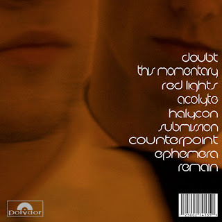 Furthermore we have taken another image of the band to use on the reverse of the digipak. Previously it was a plain black background which featured a glowing track listing centred. Here we have removed the glow and moved the track listing to right. It is a close up image of two members of the band. We changed the colouring of the photo, so it blended in well with the glow on the front cover.
 Here is the inside panel of the digipak, which will be opposite the disc tray. The crackling television used on the front cover inspired us to create this effect on photo shop, over a photo of the band wearing animal masks. The image is distorted, and it isn't clear what is actually on view here. This should be intriguing to the audience.
 Above is the second inside panel which features a disc tray, to hold the CD. This is the most minimalistic of the four panels, as it is just static from a TV covering the whole panel. This continues the television theme of the digipak.
Wednesday, 3 March 2010
Digipak Development:
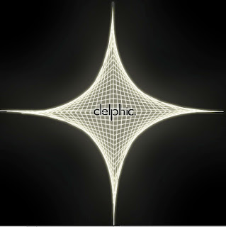 The panels we need are two inside one with disc tray feature and a back panel with album track listing. Here is a rough design of the back:
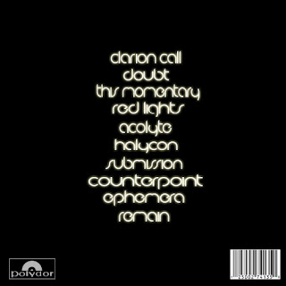 The design is very simple to mirror the album artwork. we still have album credits to include at the bottom. The problem is that there is a lot of plain black space, so it may be changed.
